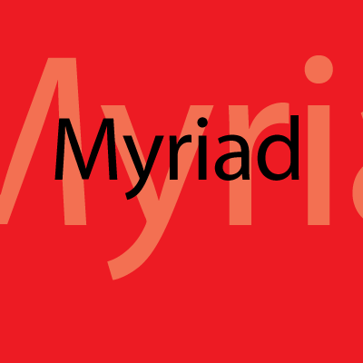
Myriad et Apple
Posted by Zora on June 30th, 2007 filed in extraits du webIn 2002, Apple gradually started using a variant of the Adobe Myriad font family in its marketing and packaging. As new revisions of its products were released, the text changed from the serif Apple Garamond to the sans-serif Myriad Apple. The family’s bolds are used for headlines, and other weights are also used accordingly. The Myriad font family was designed by Robert Slimbach and Carol Twombly for Adobe. Adobe’s most recent version of Myriad is “Myriad Pro,” which has some additional enhancements and character set extensions, but is not significantly changed in design. Myriad Apple, a modification produced by Galápagos Design Group, incorporates minor spacing and weight differences from the standard varieties, and includes Apple-specific characters such as the company logo. In 2006, Myriad Apple was superseded by Myriad Set, which contains extra ligatures and other minor changes. While Myriad Set is for most titles and eye-catching slogans, some text is set in Helvetica Neue.Although originally promoted as Myriad, the newest iPod and iPod nano feature a bitmap font known as Podium Sans which is missing Myriad’s trademark features such as the splayed ‘M’ and distinctive ‘y’.
Myriad is a humanist sans-serif typeface which means that the forms are based on classic romans, like conventional serifed fonts but without the serifs. Since 2002 Apple has used it as its corporate font.
Available from: Linotype and Adobe
Designers: Robert Slimbach and Carol Twombly
Foundry: Adobe
When: 1992
Category: Sans Serif

Leave a Comment